Believe it or not, your movie theater signage can make a massive difference in the revenue of your...
Driving More Sales With Great Digital Menu Board Design
A primary goal of every quick-service restaurant should be to drive more sales. However, this is often easier said than done. Many businesses overlook the impact that their signage can have on their revenue. Believe it or not, the use of digital signage by QSRs has been shown to lead to an increase of 3% in margin per transaction. However, not all signage is created equal. Far too many QSRs miss out on sales due to subpar digital menu board design.
Let’s dive into a few digital menu board design tips and strategies your business can utilize to boost sales in your stores!
Understand Your Goals
To maximize the effectiveness of your menu boards and enhance sales, it's imperative to note your high-level goals and how they connect to your current setup. For instance, consider the size and placement of your displays and what content should be featured where to optimize visibility and readability.
Try to put yourself in the shoes of your customers, and imagine what they think when they step into your store and view your menu boards. Your business should strive to ensure that key aspects of your signage are visible from all over the store, and that your digital menu boards are legible from further away than right in front of the register.
Understanding that all of your screens do not have the same goals is a critical step in creating a winning menu board design strategy.
Prioritize Visual Hierarchy and Layout
Creating an intuitive viewing experience for your menu boards is paramount to driving more sales. Be sure to arrange menu items strategically, placing the most emphasis on the popular and high-margin offerings that drive the most revenue.
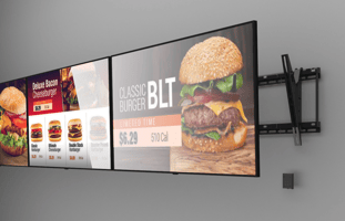
Don’t be shy to utilize bold colors and large fonts to draw attention to key items. Group similar items together for easy navigation, and look to include enticing food imagery to stimulate appetite.
Overall, your menu board layout should be easy to read and promote swift decision-making, enhancing the overall in-store experience for customers.
Keep Messaging Simple
Keep it simple. Incorporate concise, descriptive language regarding your menu offerings. Avoid clutter and unnecessary text, focusing instead on highlighting key items and promotions. Remember, simplicity is key to facilitating quick decision-making. The average human attention span is under nine seconds. If your menu boards are flooded with information, it will be extraordinarily challenging to capture your customer’s attention long enough for all of that information to be absorbed.
Use Motion and Animation
What’s the point of having digital menu boards if you only plan on using static imagery? All QSRs should make ample use of motion and animation on their digital menu boards.
Motion is extraordinarily effective at capturing customers' attention and drawing them to key promotions. Strive to use motion to guide customers' visual path toward the high-margin items you want to sell more of.
However, be sure not to go overboard, as too much motion can overwhelm and confuse the viewers of your signage, diminishing the quality of your in-store experience.
Highlight High-Margin Items
If your business is serious about maximizing revenue, it should make a concerted effort to showcase its major revenue drivers on its menu boards.
Utilize attention-grabbing graphics and motion to create urgency and encourage impulse purchases for your high-margin items. By spotlighting high-margin items, you can capitalize on customers' interest and boost overall sales.
Ensure Your Business Has The Necessary Tools
Before you seek to truly optimize your menu boards and drive more sales, take a step back and evaluate your technological capabilities. Does your digital signage solution allow for dynamic population, personalization, and seamless imagery testing? Can you daypart based on location and day of week? If you are answering no to these questions, your business likely needs to level up its CMS.
Additionally, invest in quality hardware if you haven’t already to ensure the messaging on your boards looks as pristine as possible. Many QSRs make the mistake of rolling out cheap screens, only to realize that the brightness of their screens is so low that their visuals can’t even be seen at times.
If you want the best results, you need the best technology and infrastructure in your corner.
---
By following the right steps, your business can leverage digital menu board design to drive more sales. If you’re interested in delving into a bit more detail on each of these recommendations, we encourage you to download the full eBook!


